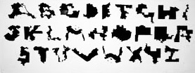
Ugly Gerry is a font created in 2019 to protest gerrymandering. It used the shape of a U.S. congressional district for each of its characters.
It was designed by Ben Doessel and James Lee of the Leo Burnett Agency in a project for Represent Us.
The team was from Chicago, and after seeing how crazy the Illinois 4th district had become, they became interested in this issue. … Its notorious earmuff shape looked like a U, then after seeing other letters on the map, they created a typeface so their districts could become digital graffiti that voters and politicians couldn’t ignore.
Shapes that loosely resembled the letters ‘A’ through ‘Z’ were used to create the (uppercase) font. Some of the shapes were not of single districts but instead combined pairs.
Ugly Gerry has been called “the world’s most revolting font”.
—
‘type is what meaning looks like.’
-max phillips
—
source credits: ben doessel and james lee, leon burnett, democrat docket, wikipedia
Discover more from I didn't have my glasses on....
Subscribe to get the latest posts sent to your email.

I hadn’t seen this before. Thanks.
LikeLiked by 1 person
it was new to me as well, but a great form of creative protest
LikeLike
That’s a clever idea, and I hope lots of people use that font to make their protest known.
Best wishes, Pete.
LikeLiked by 1 person
right
LikeLike
Interesting Beth, I had never heard this before.
LikeLiked by 1 person
new to me too, but a reaction to political craziness with a bit of art
LikeLike
There is a story behind some fonts. Let’s just say I would be willing to read only a very short page in this one!
LikeLiked by 1 person
same
LikeLiked by 1 person
how interesting. it’s – though – as ugly and your orangey man’s handwriting – and probably as illegible too. goes straight in my collection of fascinating, unnecessary, mildly amusing ‘facts’.
LikeLiked by 1 person
you never know when they’ll come in handy
LikeLike
It is INDEED the world’s most revolting font. Our NC districts can be crazy — there are several that make me cock an eyebrow but I never would have thought to create letters from them!
LikeLiked by 1 person
creative people have no limits and that’s a good thing
LikeLike
Very very interesting.
LikeLiked by 1 person
Sigh…The name Ugly Gerry says so much.
LikeLike
This is the first time I’m hearing of this font. I’ll look and see if my computer has it but I don’t think so.
LikeLike
I never knew about this font. But what a clever way to make a point in a form of resistance.
LikeLike
Ugh! Barely recognizable as an alphabet. Probably illegible as words.
LikeLike
Wow!
LikeLike
Love it! I’ll have to share this with my design guy.
LikeLike