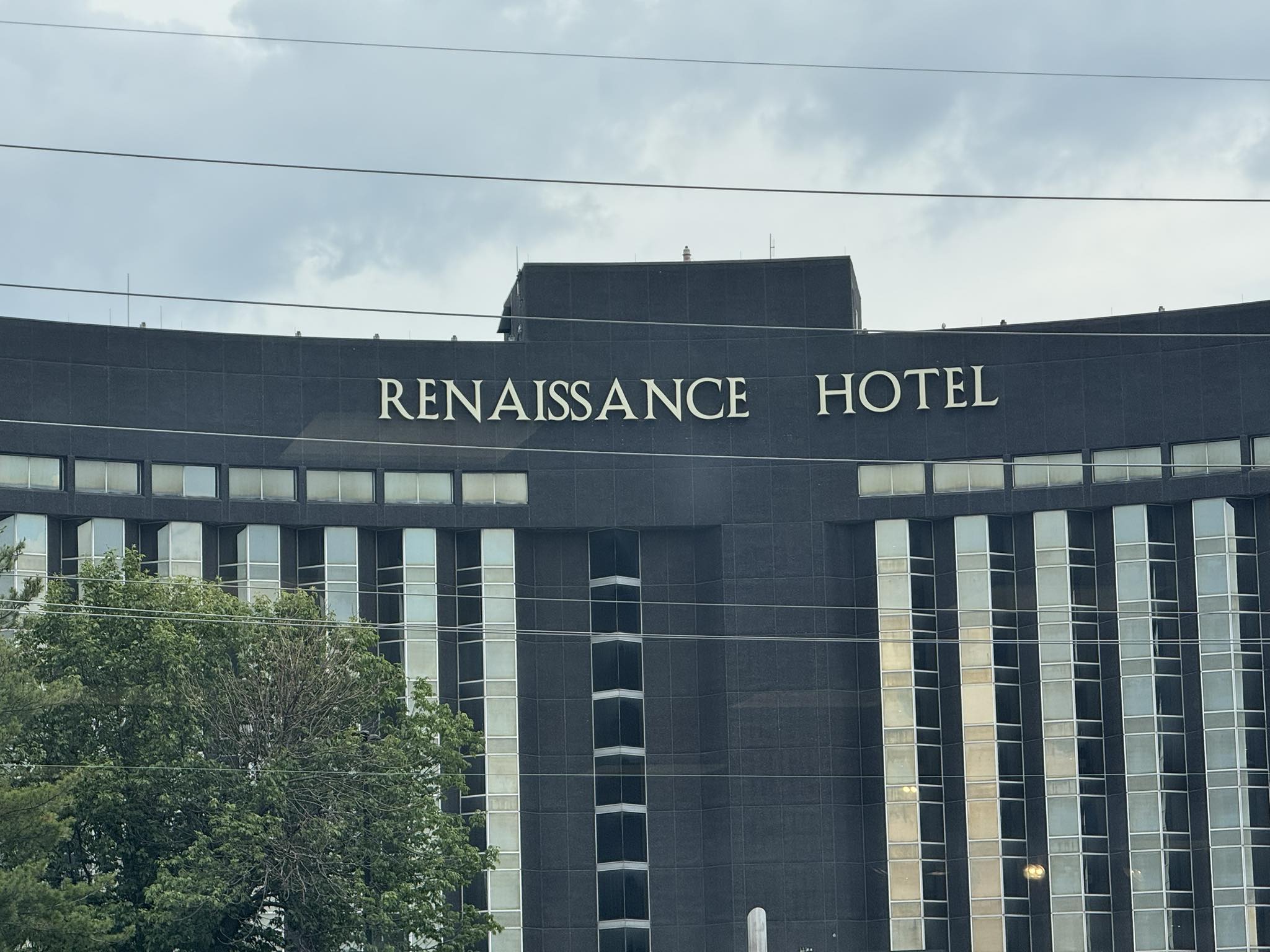
this picture of a hotel’s name
was posted on social media recently
with the poster saying
he has driven by it daily
every day
for eight years
and it always makes him kind of crazy
how the two s’s are so close together.
many people responded by agreeing
or mentioning other letters
that bother them in this layout
their size, placement, spacing, angle of the letters, etc.
the conversation got quite funny
some even wondering
about how the person/people
who put the display up
must have felt about it
did they only put up one S by accident
and someone noticed and had to tell them
to add one more?
were they trying to stylize it?
is that how the owner wanted it?
did they not know how to spell renaissance?
someone had to have ordered the letters.
is it something that should really bother people?
I have to admit that I did
notice everything that was mentioned
once it was all brought up.
how do all of you feel about it?
would it bother you
if you saw it
every day
for eight years?
maybe they just should sell the hotel
rename it, and start over
so everyone can be at peace once more?
—
“perfection is not something the world has to offer.”
― T.M Cicinski, The Mind Is Its Own Place