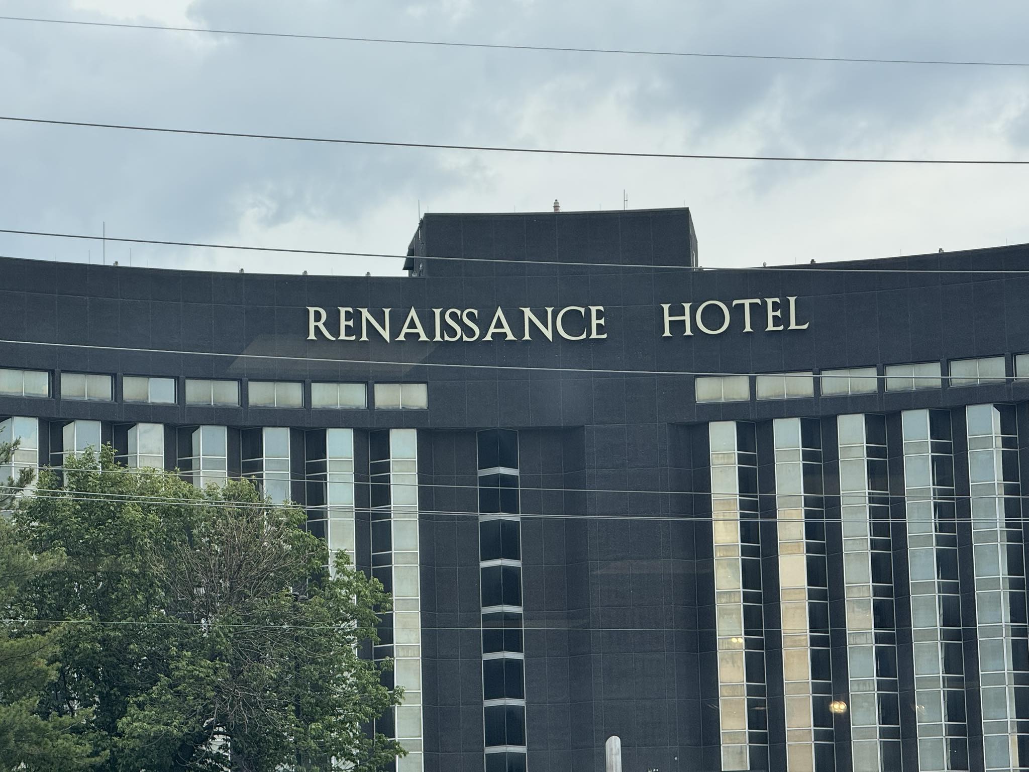
this picture of a hotel’s name
was posted on social media recently
with the poster saying
he has driven by it daily
every day
for eight years
and it always makes him kind of crazy
how the two s’s are so close together.
many people responded by agreeing
or mentioning other letters
that bother them in this layout
their size, placement, spacing, angle of the letters, etc.
the conversation got quite funny
some even wondering
about how the person/people
who put the display up
must have felt about it
did they only put up one S by accident
and someone noticed and had to tell them
to add one more?
were they trying to stylize it?
is that how the owner wanted it?
did they not know how to spell renaissance?
someone had to have ordered the letters.
is it something that should really bother people?
I have to admit that I did
notice everything that was mentioned
once it was all brought up.
how do all of you feel about it?
would it bother you
if you saw it
every day
for eight years?
maybe they just should sell the hotel
rename it, and start over
so everyone can be at peace once more?
—
“perfection is not something the world has to offer.”
― T.M Cicinski, The Mind Is Its Own Place
Discover more from I didn't have my glasses on....
Subscribe to get the latest posts sent to your email.

I doubt I would have noticed, but once seen, it is so obvious that the two S’s are too close together. But it’s a first-world problem, in the grand scheme of modern life.
Best wishes, Pete.
LikeLiked by 1 person
right
LikeLiked by 1 person
As Pete says….
LikeLiked by 1 person
I get that and I just found the responses fascinating and I can’t unsee it now )
LikeLiked by 1 person
Accident or not, it’s getting a lot of conversation started. Can’t buy that kind of advertising! 🤣 But yes, looking at it also bothers the perfectionist in me too. 😂
LikeLiked by 1 person
Very true from an ad perspective, but now that I know I’ve noticed so many things that are off about it and I can’t unsee them ))
LikeLiked by 1 person
As a graphic designer, this is unacceptable. It looks like the SS is in a completely different font. A condensed version of the normal width font used for the other letters. But then again, it looks like the building is curved so maybe it is an optical illusion.
LikeLiked by 1 person
Omg, a new possibility! )
LikeLiked by 1 person
🤪
LikeLike
😉
LikeLike
If you hadn’t mentioned it, I wouldn’t have picked it.
LikeLiked by 1 person
But now that you know…
LikeLiked by 1 person
It would drive me nuts and it is obviously an error that they decided to fix cheaply – not ideal but hey…
LikeLiked by 1 person
Right! Someone probably had to break it to the installer
LikeLiked by 1 person
Oy!
LikeLiked by 1 person
uh, bob…….
LikeLiked by 1 person
Haha!
LikeLike
Nicely written.
LikeLiked by 1 person
Did I have any typos or spacing errors? If yes, they may or may not have been intentional
LikeLike
I’m chuckling, because the tight ISS spacing would also bother me if I saw this sign regularly. As would the big space between the A and the N. But, yeah, Pete’s right about it being a first-world problem. 🙃
LikeLiked by 2 people
So right on all counts. And then, I noticed that the N’s looked giant and the last word looked slightly slanted upward and the space between the two words seemed too large and….
LikeLiked by 1 person
The more you see it the more you think about it
LikeLiked by 1 person
Exactly right!
LikeLiked by 1 person
👍🏼👍🏼👍🏼
LikeLike
It was too high up for me, and I didn’t have my glasses on …….
LikeLiked by 1 person
Aha!
LikeLiked by 1 person
Hmm…not something I’d stress over. The problem happened during installation.
LikeLiked by 1 person
Very highly likely
LikeLiked by 1 person
I wouldn’t have thought anything about it at until you pointed it out. I went straight to Google and researched Renaissance Hotel fronts. I couldn’t find another on like this.
LikeLiked by 1 person
The most likely scenario that I can figure out is that whoever put it up, probably forgot about the second S and tried to just jam it in there
LikeLike
Not gonna lie…it would drive me bonkers! Wanting to know if it was intentional or done because of some structrual/installation need. I’d probably find a way to ignore it, but I’d remember! 😜
LikeLiked by 1 person
Exactly!
LikeLiked by 1 person
🥰🤣🥰
LikeLike
Love it. Love the discussion even more.
LikeLiked by 1 person
I just could not stop reading it once I started. It was absolutely fascinating. How wide the range was of how people dealt with it and reacted to it.
LikeLike
Well, actually, those two SS close together just look wrong. I think it would irritate me every day.
LikeLiked by 1 person
I get that
LikeLike
🙃
LikeLike
Given all the years I spent dealing with typography, this really pains me. I can think of no valid excuse/reason for this.
LikeLiked by 1 person
As I mentioned so many people commented on this and I think quite often is also people that edit things automatically when they read or have worked in a field like that that see it immediately. Also, as some people have mentioned in marketing and advertising sometimes people do things like this on purpose to have their logo noticed. It could be either situation.
LikeLike
One way to get free advertising.
LikeLiked by 1 person
Definitely getting noticed
LikeLiked by 1 person
I’m sure the guys that put up the SS’s are now digging post holes.
LikeLiked by 1 person
Oops!
LikeLiked by 1 person
Perhaps this was intentional, to capture attention. A marketing strategy. That’s my opinion.
LikeLiked by 2 people
Very possible- a real marketing ploy
LikeLike
Would drive me nuts, too. I’d say it was a corporate attempt to stylize it and the attempt is a failure.
LikeLiked by 1 person
possibly or just installation errors?
LikeLiked by 1 person
EVERYTHING is wrong with it!! I may have to sleep with the lights on tonight!
LikeLiked by 1 person
yess!!)
LikeLiked by 1 person
The spacing looks ok but unfortunately the A slopes away from the second S. Maybe it is a Republican Hotel?
LikeLiked by 1 person
and now the N’s look huge and the second word looks like it’s angled up and the space between the two words is too big…
LikeLiked by 1 person
I needed to see it in real life to judge it. But from this perspective, the “ISS” is really a bit unpleasantly squeezed together.
LikeLiked by 1 person
yess-)
LikeLiked by 1 person
made an S of themselves, eh?
LikeLiked by 1 person
hahahaha
LikeLiked by 1 person
if it was misspelled, that would drive me crazy. but the design, not really. ( try not to be a form over substance kind of guy :) )
LikeLiked by 1 person
I feel like someone probably had to add the second s in later –
LikeLiked by 2 people
Seems quite posible 🤓
LikeLiked by 1 person
and who had to tell him? )
LikeLike
It looks weird the second you look at it. Looks as if they might have done it for the spacing but should have put the E and H closer together to make room for the second S. LOL
LikeLiked by 1 person
so many things going on there when you really start to look at it as a whole )
LikeLike
Definitely.
LikeLiked by 1 person
bit of a visual anomaly but too small for mine to worry about or make a fuss over —- maybe the person’s autistic: they have extra acuity —
LikeLiked by 1 person
there were lots and lots of people who it bothered and it was just interesting to read the comments
LikeLike
It doesn’t bother me as much as it would someone who likes things orderly, but it does pique my curiosity. I’m going with the theory that someone forgot they needed an extra S.
LikeLiked by 1 person
yes, why it would both some more than others. it really made me curious as well and I loved the range of answer. I agree the forgotten second S is the most likely scenario and I can only imagine the scenario of the person who had to tell him )
LikeLiked by 1 person
You’re right – they should sell the place and start over! :)
LikeLiked by 1 person
easiest solution at this point ))
LikeLiked by 1 person
Boss to sign hangers: Get off your esses and fix that spacing! Good one, Beth.
LikeLiked by 1 person
hahahahaha – yess!
LikeLiked by 1 person
😂 To be honest it’s bit disturbing. I feel his pain. Can’t they just redo it all together?
LikeLiked by 1 person
that’s what I would have done if I was in charge of the project
LikeLiked by 1 person
I agree it is not quite right but it does not bother me. :-)
LikeLiked by 1 person
I can see how it would bother some people more than others
LikeLiked by 1 person
Don’t ssweat the ssmall sstuff! 😜😂😂
LikeLiked by 1 person
well…..)
LikeLiked by 1 person
Yes, it would bother me. I’m surprised it wasn’t fixed moments after the letters were erected.
LikeLiked by 1 person
I wonder if it may have taken some time before someone noticed –
LikeLiked by 1 person
Good point.
LikeLiked by 1 person