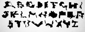
Ugly Gerry is a font created in 2019 to protest gerrymandering. It used the shape of a U.S. congressional district for each of its characters.
It was designed by Ben Doessel and James Lee of the Leo Burnett Agency in a project for Represent Us.
The team was from Chicago, and after seeing how crazy the Illinois 4th district had become, they became interested in this issue. … Its notorious earmuff shape looked like a U, then after seeing other letters on the map, they created a typeface so their districts could become digital graffiti that voters and politicians couldn’t ignore.
Shapes that loosely resembled the letters ‘A’ through ‘Z’ were used to create the (uppercase) font. Some of the shapes were not of single districts but instead combined pairs.
Ugly Gerry has been called “the world’s most revolting font”.
—
‘type is what meaning looks like.’
-max phillips
—
source credits: ben doessel and james lee, leon burnett, democrat docket, wikipedia
Discover more from I didn't have my glasses on....
Subscribe to get the latest posts sent to your email.

I hadn’t seen this before. Thanks.
LikeLiked by 2 people
it was new to me as well, but a great form of creative protest
LikeLiked by 1 person
That’s a clever idea, and I hope lots of people use that font to make their protest known.
Best wishes, Pete.
LikeLiked by 2 people
right
LikeLiked by 1 person
Interesting Beth, I had never heard this before.
LikeLiked by 2 people
new to me too, but a reaction to political craziness with a bit of art
LikeLiked by 1 person
There is a story behind some fonts. Let’s just say I would be willing to read only a very short page in this one!
LikeLiked by 2 people
same
LikeLiked by 2 people
how interesting. it’s – though – as ugly and your orangey man’s handwriting – and probably as illegible too. goes straight in my collection of fascinating, unnecessary, mildly amusing ‘facts’.
LikeLiked by 2 people
you never know when they’ll come in handy
LikeLiked by 1 person
It is INDEED the world’s most revolting font. Our NC districts can be crazy — there are several that make me cock an eyebrow but I never would have thought to create letters from them!
LikeLiked by 2 people
creative people have no limits and that’s a good thing
LikeLiked by 1 person
Very very interesting.
LikeLiked by 1 person
indeed –
LikeLiked by 1 person
Sigh…The name Ugly Gerry says so much.
LikeLiked by 1 person
that it does
LikeLiked by 1 person
This is the first time I’m hearing of this font. I’ll look and see if my computer has it but I don’t think so.
LikeLiked by 2 people
I don’t think it will be readily available, it sounds like it was a short term political artistic statement of sorts
LikeLike
I never knew about this font. But what a clever way to make a point in a form of resistance.
LikeLiked by 2 people
I so agree, Audrey
LikeLike
Ugh! Barely recognizable as an alphabet. Probably illegible as words.
LikeLiked by 1 person
Wow!
LikeLiked by 2 people
creative and protest knows no bounds
LikeLiked by 1 person
Love it! I’ll have to share this with my design guy.
LikeLiked by 2 people
yes, isn’t it fascinating as a form of creative protest?!
LikeLike
It’s as ugly as the way it’s used
LikeLiked by 2 people
absolutely
LikeLiked by 1 person
👍🏼👍🏼👍🏼
LikeLike
I must check this out Beth 😉
LikeLiked by 2 people
an interesting form of artistic protest
LikeLiked by 2 people
Indeed!
LikeLiked by 1 person
It is certainly hard to read that font. Gerrymandering has long been a big problem here in Texas. It is clearly manipulation of electoral district boundaries that allows politicians to choose their voters instead of the other way around, and here in Texas the gerrymandering is very cynical and the districts look crazy, like funny looking snakes. We just had a big gerrymandering happening again despite mid decade redistricting not being the norm/tradition.
The constitution does not say anything about it. I guess they did not foresee this. On the other hand the constitution allow you to fix it, but we aren’t. This problem exists (or existed) in a few other countries as well but they have addressed it. It certainly does not exist in Sweden (where I am from).
LikeLiked by 2 people
yes, it is terrible on so many levels
LikeLiked by 2 people
I have never heard of that font. I checked my Microsoft Word, but it is not part of the font choice.
LikeLiked by 2 people
it was created at a special time for the purpose of making a political point, and may be hard to come by –
LikeLiked by 1 person
That is really clever. I’m impressed there were enough appropriate shapes to fit the alphabet. Super creative.
LikeLiked by 2 people
some of them they put together to create a letter. be happy you didn’t have to do this to create a cover!)
LikeLiked by 2 people
Ha! Good one, Beth. :P
LikeLiked by 1 person
interesting
LikeLiked by 2 people
it’s not hard to see why this never caught on —-
LikeLiked by 1 person
Fitting.
LikeLiked by 1 person
Creative results from a power-hungry situation. Interesting share, thank you.
LikeLiked by 1 person
my pleasure
LikeLiked by 1 person
It is a very weird font, but love how it came about. I don’t recognise the shapes, but that isn’t surprising. Interesting.
LikeLiked by 1 person
A very creative way to protest. I love it.
LikeLiked by 1 person
Amazing and effective, leave it to the creatives to make a great point
LikeLiked by 1 person
😊
LikeLiked by 1 person
A great idea, it would be even better if it was legible!
LikeLiked by 1 person
It’s a bit messy but also serves to prove the point of how absurd the districts were that they drew nothing to do with a realistic district
LikeLike
True!
LikeLiked by 1 person
This is a new one for me. I can’t stand to see gerrymandering. The worst was most recent by our AG at tge epstein hearings.
Great form of protest we can all use.
LikeLiked by 1 person
yes, and I love that they used their creative power to illustrate just how ridiculous this ‘re-drawing’ of districts can be
LikeLiked by 1 person
I do think that it is unfair how they redraw districts to meet their own agendas. But politics is such a dirty, unprincipled game.
LikeLiked by 1 person
So much of politics is awful.
LikeLike
Pingback: The Saturday Blogroll Recap, March 28 2026 – Chuck The Writer
Pingback: Keratogenic Hot Links – Tacky Raccoons
Very revolting indeed but it does get the point quite clearly and effectively!
LikeLiked by 1 person
Clever message!
LikeLiked by 1 person
creatives have a way!
LikeLiked by 1 person